The NFL and the game of football share a rich history. Within the NFL’s narrative, team dynasties have experienced periods of ascent and decline. Devoted NFL enthusiasts take immense pride in their team’s legacy, often viewing their unwavering allegiance to the home team as a cherished tradition handed down through generations. Many franchises opt to remain faithful to their historical roots, firmly embracing their cultural identity and image. A steadfast commitment to preserving these long-established traditions can deepen one’s affection for a team.
While some teams grow restless and feel compelled to revamp their uniforms and logos, others, such as the Green Bay Packers, Chicago Bears, and Pittsburgh Steelers, remain resolute, making only minor, if any, alterations. It’s unclear why some franchises decide to make these changes, but if I were to hazard a guess, it might be due to popularity and on-field performance. Teams are less likely to undergo such transformations if their rich history and consistent success are firmly in place.
The Miami Dolphins, too, carry a storied legacy, boasting two Super Bowl championships, including a perfect season, a legendary Hall of Fame quarterback in Dan Marino, and a record-breaking coach in Don Shula. Thus, it remains puzzling why a franchise that has contributed so significantly to the league’s rich history has allowed its integrity to be tarnished by multiple rebrandings under different ownerships over the years.
I acknowledge that this topic might be deemed trivial, and I am aware that the changes made haven’t altered the team’s name or colors. However, Miami’s iconic logo has undergone significant transformations, resulting in what many consider a diminished version of its former self. This serves as an indicator of ownership priorities that appear misaligned with the essence of the team. It is entirely normal for us, as fans, to resist this mindset.
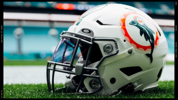
In 2013, the greatest iteration of the Miami Dolphins logo, since the original, was retired for this current diluted version. This change left the fan base divided in their opinions, with a majority expressing dissatisfaction. Despite the discontent among fans, Stephen Ross appears resolute in his decision to alter the logo. Now, after a decade has passed since the change, the outcry from fans clamoring for the restoration of the classic logo remains robust.
This Sunday, the Dolphins are set to square off against their division rivals, the New England Patriots. The team will take the field in their white throwback uniforms. It will be a sight to behold, with some even claiming that Miami’s white throwbacks rank as the best uniforms in the league. Given the overwhelming support for these beautiful uniforms, along with their solid aqua counterparts, will this finally persuade Mr. Ross to heed the fans’ wishes? Or will it require new ownership in the future to restore the team’s classic and signature look? Only time will tell.


If it even took the fans to pay for the permanent change, I bet we all would do it. This current “sea world” powder green unis are pathetic and soft. Scream “kindergarten” or some woman sport team. They are an atrocity and an insult to our teams of yesteryear. Miami went from best in the league to worst in the league in uniforms. So, say it took $50M give or take to make the permanent logo change from the players unis to throughout everywhere, the stadium, team bus, bathrooms, all merchandise. There has to be like 10M Dolphin fans if not more, around the world. Each of us send in $5 to Mr Ross as a ‘uni – go fund me’ donation and there you have it ! Simple. Or Ross puts up half and the fandom puts in the rest. He will make it up in the first year sales of jerseys etc, etc. Sadly, I don’t buy merchandise that has that ‘free wily’ whale on it now. Only merchandise that says “Dolphins or Miami” without the fake dolphin on it. I believe there was some moratorium about changing logos, but that is done now after 10 years of having this garbage. Could you see Csonka in this current uni? I can’t !